Following up from February, I’ve created the second cover in
the Mack
‘n’ Me ‘n’ Odyssey series. The second novel, Mack ‘n’ Me: Blaedergil’s Host
takes place a little ways down the track and has a bit of political intrigue,
but essentially continues the story of Cutter and Mack as they work out their
working relationship.
The first step was the usual use of a template designed for
the series.
The second step was a lot easier because of my previous
forays onto Dreamstime. I chose a planetary background by Forplayday that had a myriad of
stars, because it seemed reminiscent of the word ‘host’ in the novel’s title.
It needed to be resized, and then the layer had to be shifted so that it lay
under the words for the title and byline.
After that, I used the second in a series of characterimages by Yekophotostudio that I’d found on Dreamstime. I tried out how it
looked both under the planet layer, and above it, and decided to over lay it.
After that, I isolated the guy and girl elements from the original background,
and positioned them at the base of the cover in the foreground.
That was the easy part.
The next step was to get them to blend together to form a
more cohesive image. At this point, I decided the flesh tones and natural
colouring weren’t quite what I was looking for, although they looked okay. All manipulation was done in GIMP.
The first thing I did was darken the character image to -29,
using the ‘Color Saturation’ tool under the Colors drop-down menu. I then
decreased the Hue Saturation to -49 in the ‘Hue Saturation’ tool under the
‘Colors’ drop-down menu, and then highlighted the planetary layer, and
then I played with the ‘Brightness-Contrast’ tool (also found under the
‘Colors’ drop-down tab, and adjusted the entire image, bringing the brightness
up to +2, and increasing the contrast to +58.
I still wasn’t happy with the effect, so I used the ‘Color
Balance’ tool to adjust the background, increasing the hue saturation by +38,
reducing the lightness by -33 and increasing the saturation by +15. After that,
I decided I wanted more yellow in the background, so I used the ‘Color Balance’
tool to reduce the yellow-blue balance by -49.
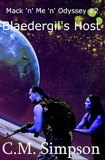
After that, I wasn’t sure if I was happy with the
background, or not, so I returned to the step I’d saved as Dev10—and this
taught me the important of saving the image at each step, because it’s much
easier to go back to a saved step and rework it, than to try to undo everything
to get the image looking like it did, at that step. It’s
also useful to put the abbreviated changes into the saved .jpg file title, so
you remember what you did, when you go back to it.
After returning to Dev10, I
used the Color Balance tool to increase the yellow-blue balance by +60, and
then reduced the cyan-red to -18, and finally tweaked the yellow-blue colour
balance line another -49 on the planetary layer. The last step was to use the
Brightness-Contrast tool to reduce the brightness by -49, so that the words
became more visible.
This was the image, I finally decided on.
Of course, I then discovered I’d missed something while
isolating the character image. The errored image is on the left, the corrected
image on the right. I count it as a lesson in vigilance.