Showing posts with label #newcover. Show all posts

Thursday, 29 March 2018

Latest Cover Design—Dear Tiger: Omnibus


Since the plan is to release an omnibus collecting all six stories in the series, I decided to design the omnibus cover as soon as the cover of the sixth book was finalised. All images were sourced from artists and photographers on Dreamstime.

I started out with the template I’d used to create the covers for the books in the series, and then added in the Roberto Pirola planetary background I was using to link the series together. I thought about using FengYu’s photograph of the letter I used for the first book, and added that in, as well.


Since the monster eyes by Plus69 were a major feature of two covers, and represented the main character, I chose to include them on the omnibus cover, as well. I also wanted to include Junichi Shimazaki’s spaceship, as there is a lot of space travel in the series. And, finally, I wanted the Ruins (sourced from Vincent St Thomas), because ruins are featured throughout the series.


As you can see, that meant the cover image was too crowded, so I had to remove one of the elements. I ended up taking out Feng Yu’s pictureof stationery as letters quickly become emails in the stories. This meant I needed to re-position Junichi’s space ship, before adding in the eyes that represent the other changeling characters in the story. The eyes were given new angles by using the Rotate Tool in the Toolbox.

First each pair of eyes had to be positioned, and then the layers linked by clicking on the chain icon beside each. Once linked, the eyes, the Rotate Tool was selected, and the eyes pivoted to their new position. These icons had to be unclicked before the next pair of eyes could be positioned, as everything with a chain link that had been clicked turned when the Rotate Tool was used.
The eyes I used were sourced from Hanna Darzy's Thai Cat, Plus69's Monster Eyes, and Panaceadoll's sets of eyes.


The final cover looked like this:


Wednesday, 28 March 2018

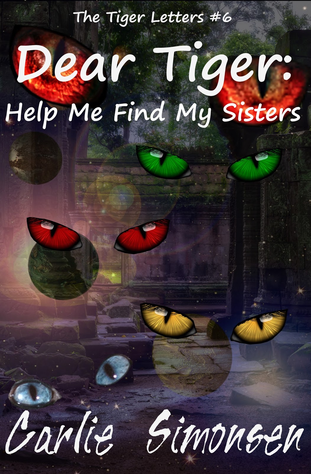
Latest Cover Design—Dear Tiger: Help Me Find My Sisters

The final cover in a series can sometimes be the hardest, or the easiest of them all. I’m still not sure about this one.

To start with, I wanted to link the ruins in the story to cover, so I used the cover from the fifth book as my template. I then removed the Junichi’s most excellent spaceship, and set about isolating each eye in aset of eyes sourced from Panaceadoll at Dreamstime.

I also wanted to link the cover in with Book 3, I Like Your Lab, so I used the eyes I’d already isolated from the monstereyes sourced from Plus69 at Dreamstime. Lastly, I isolated the wonderful, blue eyes from the thai cat photographed by Hanna Darzy, also at Dreamstime. I imported each of these as layers and arranged them on the cover.


Finally, I realised I had to add the short story warning to the base of the cover just above the author by-line, and then I needed to use the Brightness-Contrast option under the Colors tab in order to make the white lettering more visible over the eye by reducing the brightness of each eye layer by -8, and increasing the contrast of each eye layer by +13.

This is the final cover:


Sunday, 25 March 2018

Latest Cover Design: Mack ‘n’ Me: Origins


Looking back, I can see that February was a month for designing science fiction covers… and that this is a trend that is likely to continue, given that there is also a series of science fiction novels coming.

Here is the cover process for the novel. Knowing it was going to be a series, I knew it would be ideal if I could find several photos with the same models dressed the way I needed them. That part was essential. This was trickier than it sounds because I wanted a female with a gun. I know I’ve mentioned this before, but it still hasn’t changed. Male photographers… and even some female ones, don’t seem to understand that women who can use a weapon should be dressed – and posed! – like they mean serious business… not like some sex kitten for whom a gun is a novelty toy, and the battlefield a far off idea, and certainly not like a victim waiting to happen.
 
I wanted a picture for a female lead who was tough, savvy, and knew how to use the weapons she carried. I wanted someone looking purposeful, not afraid, mischievious, or wanton. It took me a while to find one, and then I came across a series of character images by Yekophotostudio at Dreamstime. Images with a girl AND a guy who both look like they’re ready to deal some serious business. I had found my Mack and Cutter – and they were even in the same photo. Bonus!

First up, I chose a different font to the one used for the title of C.M.’s short stories. I wanted something a little bit more ‘science fiction’. For this, I used GIMP’s Verdana font—and I used GIMP’s Sylfaen for the byline. The background layer, I kept black.

The second step was to use the ‘Open as Layers’ option under the ‘File’ tab to import Keremgor’s ‘science fiction buildings’ image (also from Dreamstime) into the cover. It was a little small, so I had to use the ‘Scale tool’ in the Toolbox to increase the size.


(TIP: When using this tool, make sure the chain link beside the height and width boxes is UN-broken, or the image will not size proportionately.)

I also had to move the picture layer down in the 'Layers' box so that it sat behind the words' layers.

The second thing I did was use the ‘Flip tool’ in the tool box to reverse the image so the buildings and moon were on opposite sides to the original. The final step in this phase was to drag the image around using the ‘Move tool’ in the Toolbox, until I had it positioned where I wanted, before I used the ‘Autocrop Image’ option in the ‘Image’ tab drop-down to trim the layer to the cover size and excise any unneeded portions of Keremgor’s image.


After that I went through the process for isolating Yekophotostudio’s characters from their original background, and using the ‘Open as Layers’ option in the ‘File’ menu to import them into the cover image document. After that, I resized them, and then increased the contrast of that layer using the ‘Brightness-Contrast’ option in the ‘Colors’ tab drop-down.


I didn’t like the hard edges to the flames, so I used the ‘Erase tool’ in the Toolbox, choosing a circle with blurred edges, and adjusting its width and opacity before using it to fade the fire and blur and blend the edges into the background image. Once that was done, I blurred the hairline, the gap between the characters and other edges that bothered me.


When I was happy with the way the character image blended with the background image, I played with GIMP's ‘Brightness-Contrast’, ‘Color-Balance’ (blue), and ‘Hue-Saturation’ (blue) options to be found under the ‘Colors’ tab on the top menu—and then I blurred the hairline some more, because it had started to bother me, again.


This is the final cover:

Sunday, 18 March 2018

Latest Cover Design: Dreams of the Serpent

The third cover designed in February was another science fiction cover, but for a short story – and one set mainly on a world. The hardest thing about this cover was finding a suitable alien landscape. I wanted a rocky plateau, but couldn’t find one that would allow me to put a humanoid figure in the foreground, so I decided on a river background. That was more accessible, and I was pleasantly surprised by the quality of artwork I found.

This cover only shows part of the entire river image by Melkor3d at Dreamstime, and the artist has quite a number of other evocative landscapes that would make suitable book-cover backgrounds… or for other projects.

Because I’ve worked on a number of these short story covers now, the branding is fairly settled, so I can prepare the title, background and byline quite easily. I use Berlin Sans FB for the title, and Baskerville Oldface for the byline – and GIMP for the cover creation. The process is the same I use for Carlie’s titles, where I firstly create a black background and then add the words.

In this case, I had to import the river landscape as a layer, using the ‘Open as Layers’ option in the ‘File’ tab drop-down. Once it was imported, I resized it to cover the cover, and then used the ‘Move’ tool in the Toolbox to position it so the portion of the image that is seen is what I wanted on the cover.

Once I was happy with the background image, and its positioning, I used the ‘Autocrop Image’ option in the ‘Image’ tab drop-down to take away the parts I hadn’t used, eliminating overhang. I then opened up the lizardman image which I sourced from Junichi Shimazaki, also at Dreamstime.

Even though this image was on a white background, I still needed to remove that background, so I saved the image as a new document, using the same file name, but adding ‘isolated’ to it, and then went through the process for isolating the lizardman from its white background. As soon as that process was complete, I closed the new image, and then opened it as a layer in the cover image window.

Once again, I used the ‘Move’ tool from the Toolbox to position the lizardman on the cover, and then I used the ‘Autocrop Image’ option from the ‘Image’ tab menu to trim the cover.


As soon as this was complete, all I had to do was adjust the cover as a whole. TIP: If you want to adjust just one image on the cover, highlight the layer the image is in, and then work while that layer is highlighted (although, on a bad day for GIMP, you might need to work on the image as a separate entity, and then import it). If you want to adjust the entire image and its components, you need to highlight the background layer and work while it is highlighted.

For this image, I decreased the brightness bot negative 61, and then increased the contrast to positive 26, using the ‘Brightness-Contrast’ option on the drop-down menu under the ‘Colors’ tab.


The final cover looks like this:


Sunday, 11 March 2018

Latest Cover Design: Dear Tiger: I Like Your Lab

This is the second cover I worked on in February. It belongs to the same series as Dear Tiger: Don’t Look Back. Cover creation was a little simpler from the perspective of deciding on a background and lettering, but composition took a little decision.

To start with, I followed the same steps as I did last week, using a black background and importing the background art by Roberto Pirola at Dreamstime, as well as creating the title using white letters in Segoe Print Bold, and the byline using white letters in Tiger Rag LET.


After that, I had to decide on what I wanted to add, and, this time, I decided it was eyes. It took me a while to work my way through the Dreamstime stock images, before I decided to purchase a lovely set of beasteyes by Plus69. The only problem I had was that the image was a long, narrow band, and not at all book cover shaped, so I knew I would have to isolate the eyes and position them closer together to get them to fit on the page.

As I worked in GIMP, I discovered I couldn’t isolate both eyes in the same image. That is, I couldn’t cut around one eye, and then isolate and cut out the other, so that they were on different layers, with the background on a third. This meant I had to save the image twice under different names (left eye, and right eye, worked fine), and go through the process of shrinking the image so that no one side was longer than 525 px, before cutting out one eye, returning it to the image as a separate layer, and then making the background disappear, and returning the image to its original dimensions and saving it again.

Once I had the eyes, I opened them as layers in the cover document, and then used the move tool to position them, and the erase tool to finalise the shape, and to blur the hard edges of the isolation. I also adjusted the opacity of the eye images to that the planet background could be partially seen through them.


The final step was to use the ‘Brighten-Contrast’ button on the ‘Colors’ tab drop-down to give things a bit more definition and darken up the background so that the white lettering was easier to read.


And this cover was complete - again with many thinks to GIMP, and the artists at Dreamstime.

Sunday, 4 March 2018

Latest Cover Design: Dear Tiger: Don’t Look Back


Last week, I worked on four covers: 2 for chapter books, 1 for a short story, and 1 for a novel. I’ll go through the basic process here, but if you’d like more details on any particular process, just say so in the comments below, and I’ll do a step-by-step screen-shotted outline.

In the meantime, here is the construction of the cover for Carlie Simonsen’s Dear Tiger: Don’t Look Back.

I started with the basic cover. Set up for this was to give it a width of 1850 px, a height of 2850 px, and a resolution of 600 px/in. After that, I used the fill tool in the toolbox (the little tipping bucket), made sure the colour square at the bottom of the page was black, and gave the cover a black background. Once that was done, I used the lettering tool (the little sideways A) and Segoe Print Bold for the title, and Tiger Rag LET for the Author Byline. Lettering was white.


After that, I opened the artwork I’m using as a common background in the series, as a layer, and used the move tool in the Toolbox to position it. When I was happy with the way it was looking, I selected the ‘Image’ tab, and then clicked on the ‘Autocrop Image’ option in the resulting drop-down. I also made sure the background art layer was positioned above the Background layer, and below the Title and Byline layers.


I purchased the little starship image from Andreus over at Dreamstime, and opened it separately to the cover, so it had a window of its own. The first thing I did after opening it was to click the ‘File’ tab, and then click ‘Save as’, so I could save the image with the word ‘isolated’ in the title.
This image comes with a very nice background, which I didn’t want to use, so I had to separate it. I did this by selecting ‘Scale Image’ on the ‘Image’ tab drop-down, making sure the chain between width and length was UN-broken, and then changing the longest side to 525 px. This meant that the shortest side also changed in proportion. (If you don’t do this, then you won’t get all your cut-out image on the clipboard, which is really frustrating.)

After that, I used the ‘Zoom’ tool (magnifying glass) in the Toolbox, to magnify the image so I could see the individual pixels. Once I was happy I could see the whole image, I then used the ‘Free select tool’ (the loop of rope) in the Toolbox to draw a line around the starship, and some of the engine afterglow.

(This is done by clicking the mouse pointer around the edge of the image that you’re going to cut, so it leaves a line of dots – which are linked by a line. When you get back to the start, just click on the first dot and an outline will form.)

Once the figure was outlined, I then clicked on the ‘Edit’ tab, and clicked on ‘Cut’ in the resulting drop down. This caused the outlined ship to vanish from the screen and split the image into two layers: the layer left behind, and the layer cut out. The cut out layer appears in the clipboard, which can be found under the ‘Brushes Dialogue’ in the ‘Tool Options’ box.

To get the image back into the picture, you just left click the clipboard and drag it back into the main screen. Once it is in the main screen, you can position it using the ‘Move’ tool from the Toolbox, by clicking and dragging.

To make the background disappear, select the layer, and click on the eye symbol beside it. When the eye is invisible, the layer cannot be seen, and your isolated image will stand alone.

Remember to resize the image to its original specs, save the image, and close it.

To import the image into your cover, you need to go to the cover image that you have open, click ‘File’, and then click ‘Open as Layers’ and find your saved isolated image. Select it, and it will appear in your cover screen. You will notice it adds two layers to the Layers – Patterns window: the isolated image, and the background you have made invisible.

Move the image around on your cover until it is positioned where you want it to be.


I did two more things before calling the cover finished. The first was to use the erase tool to blur the edges of the flames form the engines. I did this by selecting one of the dots with blurry edges in the brushes box, and then adjusting the opacity of the brush in the ‘Tool Options’ box to about 57 per cent, then I rubbed at sections of the outline until I was happy with the effect. The second, and final, thing I did was to click on the ‘Colors’ tab, and then select the ‘Brightness – Contrast’ option, and adjust both settings until I was happy with the clarity of the writing on the cover.


Et voila!