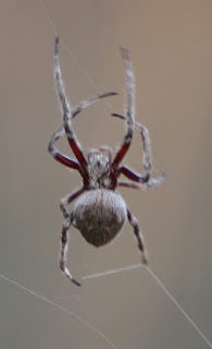
The first step, of course, was to use 'Save as' to save the picture as 'Spider_Cropped', and then use the 'Rectangle Select Tool' in the toolbox to outline the part of the picture I was interested in, and then select 'Image' from the menu bar and click on 'Crop to Selection', which gave me this:
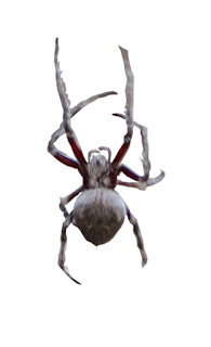
Because I wanted to superimpose just the spider over the picture, I needed to get rid of the background, so I did the following:
- I saved the picture as: 'Spider_Cropped';
- and then used 'save as' to save it as 'Spider_Cropped_Isolated'.
- Since GIMP has a clipboard limit of 525 px by 525 px, I again clicked on 'Image',
- and chose 'Scale Image' from the drop-down menu.
- I noted the actual length and width on a piece of paper so I could return the picture to its original size later, and then
- I selected the longest side and changed that to 525, which automatically scaled the shorter side so the image was kept in proportion when it was shrunk.
- Using the 'Free select tool' from the toolbox, I outlined the spider,
- and then used the 'Cut' option from the 'Edit' drop-down menu.
- This placed the cut out spider onto the clipboard.
- To get the spider back onto the image, I clicked on the clipboard and, holding the left mouse button down, dragged the spider back into the image.
- This gave me two layers in the Layers-Patterns dock.
- Because I only wanted to see the spider, I clicked on the eye beside the 'Spider_Cropped' layer. This closes the eye so the background is no longer visible. I left the eye symbol beside the 'Dropped Buffer' layer open, keeping that layer visible.
- This still left me with background in some areas where the legs met - and which I hadn't been able to cut out with the first outline. I got rid of that background, but outlining the area I wanted to remove and using the 'Edit' drop down so that I could, again, click on 'Cut'.
- When I was happy with the cut out, I resized it to its original measurements, by clicking on Image' and choosing 'Scale Image' from the drop-down menu, and putting in the original measurement for the longest side, and hitting 'resize'
- When the picture was back at its original dimensions, I saved the picture and closed it.
- This is the result:
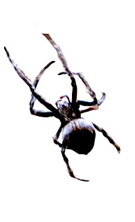
- I used the 'save as' option to save 'Spider_Cropped_Isolated' as 'Spider_Cropped_Isolated_Darkened';
- then I clicked on the 'Colors' menu button,
- and chose 'Brightness-Contrast'.
- This gave me a little pop-up box with two slide bars: one for 'Brightness' and one for 'Contrast'.
- By sliding the Brightness bar to the left, I was able to darken the spider's colours, and
- by sliding the 'Contrast' bar to the right, I was able to enhance the shading so that it had harder edges.
- NOTE: sometimes moving the slide bars does not seem to have any effect. When this happens, you have to use the 'Rectangle select tool' from the tool box to draw around the image you want the pop-up to affect. Once their is a moving dotted line around that part of the image, the Brightness-Contrast choices will be reflected inside that dotted line.
- When I was happy with what I had, I chose the 'Rotate tool' from the Toolbox to swivel the spider to the left.
- When doing this, I noticed that the legs seemed to fall off the edge and disappear, so I had to be careful to keep the legs inside the limits of the picture.
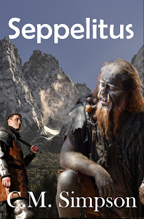
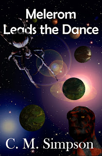
I also used the 'Rotate Tool' from the toolbox to swivel the spider 180 degrees and point it the other way. You can see it in the upper-left of the book cover.
One final note: Becaue I wanted to place the spider over the words, I highlighted the 'Dropped Buffer' layer and then used the slide bar on the 'Opacity' box at the top of the 'Layers-Patterns' dock to adjust the spider's opacity until the words could be seen through its tail.
And that is how I used GIMP to create the spider on Melerom Leads the Dance.
