Saturday 28 February 2015

Photography: People and Action - Lessons Learned on the First Attempt (Part 1)


For a very long time, now, I’ve been taking photographs. Mostly, I take shots of birds, beetles, spiders and sunsets, but I recently took up a new hobby—learning the art of ancient swordsmanship with the Ancient Arts Fellowship (AAF) in Canberra. Because I’m a recruit, I can’t join in with the melees until I’ve learnt how to swing my sword safely, so when recruit training is over I pick up my camera.

The first of these shots were a complete learning curve. I had never used my camera to take pictures of more than my small daughter tearing around the yard or ‘helping’ in the garden.

And I had certainly never pointed it at strangers.

Three weeks ago, I did both. With the permission of the AAF fighters, I photographed some of the training session. Most of the time, I focussed on the melee combat, but occasionally I took a few closer shots. If you’d asked me beforehand if I’d be taking individuals, I’d have said ‘no’, so this is something I’ll have to remember for future events.

Here is some of what I learned:

My short lens doesn’t have a filter on the glare, and so does not produce shots that are of the same quality as those I take with the close-up lens. It is, however, better for larger group shots.

short lens - no filter
close-up lens - filter


short lens - no filter
close-up lens - filter


short lens - no filter


close-up lens - filter


short lens - no filter
close-up lens - filter


short lens - no filter
close-up lens - filter


short lens - no filter
close-up lens - filter


Friday 27 February 2015

Photography, Etiquette, Art and People


The first rule of taking pictures of people is to ask the group you’re photographing if it’s okay to take their pictures. Anyone says, no, and then you have to make sure you don’t take shots of anything with them in it, or you don’t take shots of the activity they’re involved in. Some people just hate being photographed.

Second thing: if you want to submit your photographs to stock photo sites such as Dreamstime of iStock or whoever, you’re going to need a model release from every recognisable person in, or likely to be in the photographs you take. This means that if, like me, you’re not sure if you’ll be mixing the odd opportunistic ‘face’ or ‘character’ shot in with your group shots, you should get the folk to sign up early. It also means you should probably get a model release for each person prior to the activity as you never know if you will want to use the shot a few years down the track—when that person might no longer be found.

The last thing is to be generous. If you take photos at a club, provide the club with copies they can use free of charge. If you take photographs of a person, provide the person with copies of the shots that include them. After all, without them generously allowing you to take pictures, the pictures wouldn’t exist.

If you’re taking pictures of art or crafts, be sure you get the name of the artist—it’s also nice to be able to put their picture beside the picture of their artwork.

Finally, some of us take photographs as reference material. The important thing to remember with this is that you still need a model release to upload art work based on those ‘modelling’ in your photograph to stock photo sites. Even if you have no immediate intention of doing commercial work, it’s best to have the model release form recorded, in case you change your mind later.

People are awesome - most of the time - and it's nice to treat them well.

Thursday 26 February 2015

Cover Design and Creation: Anna and the Rock Dragons


Some people ask me how I come up with my covers, but I think the hardest part of any cover is coming up with the illustration. After that, the basic cover design is relatively simple. You just have to remember the following things:
  • The illustration tends to draw more attention if it contains a face or human figure.
  • The illustration is the first thing that will catch a potential reader’s eye.
  • The illustration should alert the reader to the genre.
  • Text needs to let the reader know what the book is called and who wrote it.
  • Text must be readable fro
  • All elements of the cover have to work together to draw the eye.
  • m a distance – or in a thumbnail.
  • Text should be easy to read.
  • Text should harmonise rather than dominate the cover, but it conveys the most important information, so it should draw slightly more attention than the illustration.

With these thoughts in mind, and with the illustration already chosen, I created a new image in GIMP. I made it 1875 pixels wide and 2850 pixels high, as those dimensions seem to suit the cover dimensions for a variety of platforms, and are easily adjusted to suit others. I then set the resolution at 300 pixels, as that is the minimum acceptable for most platforms. Finally, I decided I would use a black background for the cover and used the bucket-fill tool to turn the background black.
Once those basics were taken care of, I opened and resized the base illustration in a different window before saving it for import.


I imported the resized illustration, where it formed a new layer. I then enlarged the illustration layer to fit the background.


Once I was happy with how the image fit the background, I looked at the branding I had used for the Carlie Simonsen Chapter Books, and added the title and author name using the same texts.


Looking at it, I decided I wanted to differentiate Carlie’s young adults from her tween-to-young-adult chapter books, and the best way to do that was to change the script, so it looked less ‘younger audience’. This involved clicking on the Tool Options for the writing Tool.


You will notice there is a ‘Text’ box next to the Font box. If you click on the ‘Text’ box, you will get a drop-down list illustrating and naming the fonts available, and you can get a vague idea of what the text will look like before selecting it.

The main key, however, is to experiment with different fonts for the author…


… and then adjust the font size to suit.

And then you do the same for the title font, adjusting the positioning until you are happy with how it looks.


Once I’m happy with the look of the base cover, I then adjust it for the platforms with different requirements. Most, such as DriveThru and Ominlit, only need minor adjustments to size, but others, such as CreateSpace, require a slight rearrangement of elements.

Base Cover for Anna and the Rock Dragons

CreateSpace Large-Print Cover
CreateSpace Normal Print Cover


Wednesday 25 February 2015

Gimp: Using the Paint Brush to Touch Up Oil Pastel Scrimshaw

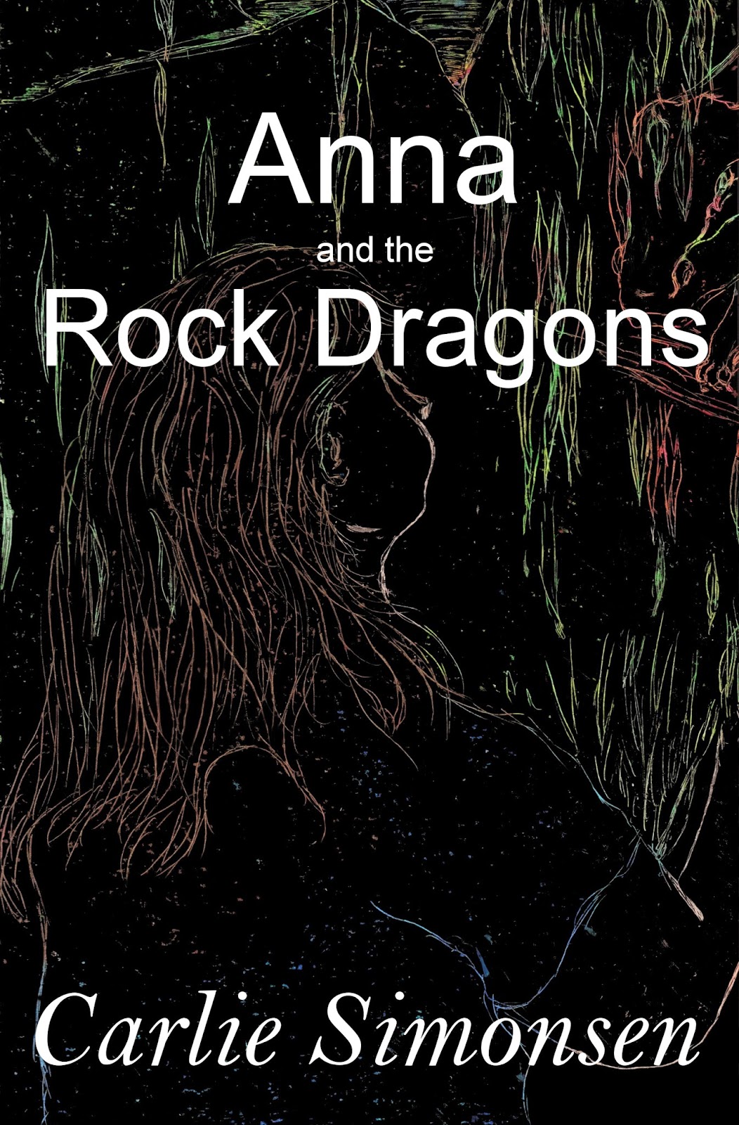
Those of you who’ve tried it will know oil pastel scrimshaw is fun, messy and somewhat unpredictable. You’ll also know it’s difficult to avoid some kind light glare when photographing the end result, regardless of whether you dull your flash using tissue paper, use overhead lighting rather than a flash, or use natural lighting. It’s just the nature of the pastel.

flash reflection
daylight reflection
flash softened by tissue
Scanning produces a result without the reflection, but limits the size in which you can work. This piece was scanned to avoid reflection distorting the picture.


Once the piece was scanned, I noticed that the colour was uneven and the line-work needed cleaning up—how much depending on how much of the original scrimshaw effect I wanted to preserve.

First, I opened the scan in Gimp and then saved the scan with a different name before I started work. This saves the original picture, and means I can start from scratch if I muck up the modifications.

After that, it was a matter of working out what I wanted.

I noticed the picture was lighter than I wanted, more grey than black, so I used the Bucket Fill Tool to drop a layer of black through the picture. This worked fine, but a second look showed me that there were areas of the picture that the bucket fill had missed. These areas occurred where a shape was fully enclosed from the background, such as in the gum leaves, the dragon’s head, some of Anna’s hair. It looked odd and needed touching up. The question was ‘How’?


While I was looking at the grey-black effect, I noticed I hadn’t trimmed the sketchbook binding from the image. This should have been the second step after saving the image with a new title.


I tried two ways. The first was to use the Free Select Tool (symbolised by a little lariat in the Toolbox) to trace the section I wanted to darken, and then to use the Bucket Fill Tool on the area. This was okay, but not quite what I wanted.

The second method I tried was to use the Rectangle Select Tool to choose an area, and then go to the Zoom Tool (represented by a little magnifying glass in the Toolbox) and zoom into the area until the scrimshaw lines were 1-2 mm thick on the screen.


After that, It was a matter of playing with brush sizes and Opacity in the Paintbrush Tool, Brushes and tool options boxes. I like this setting because it allows me to skim close to the coloured edges without covering them completely, so I can soften an edge rather than erase it completely. I also use a really small brush size. It is important to remember that the smaller the brush size is, the harder the edge it will produce, and the darker the line. For some of the smaller areas, I had to reduce the brush size to about 8.17, but I preferred the 15 to 18 mark for most of the filling work. It was just more forgiving and suited to most of the spaces that needed touching up or filling.

Brush pallet and options box for adjusting.


The dotted circle shows the size of the brush compared to the size of the scrimshaw line being neatened.
Another illustration of brush size - this one is smaller than the last.
There are two effects you can create with this setting: a single flat stroke and stippling.

The flat stroke is simple. You just move the pointer to create the line you want. You need to remember that this setting does not draw to the edges of the circle marking its effect, and that the darkest area will be in the centre. This gives you room for error. It is also important to remember that you can undo any brush stroke using ‘Ctrl’ ‘Z’ BUT that the longer you have drawn without ‘lifting’ the pen (usually by releasing the mouse button), the more will be undone. It is best to do relatively short strokes so that you only undo areas you need to correct, rather than a large stroke of which only the last few millimetres needed undoing.


Stippling is where you use dots (mouse-clicks) to fill an area. The effect isn’t as dense as a line effect, and allows you to leave some of the area you are filling unaffected so that some of the original colour comes through. The edges of the dots allow for a softer outline to be created, although it can take longer to undo a patch of stippling, than to undo a single line.


Gradually work your way through the picture until you have achieved the finish you want.


Tuesday 24 February 2015

Oil Pastel Scrimshaw - Brief Introduction and How-To


I like oil pastels—they’re a real challenge, and I love that. I also rediscovered a love for the scrimshaw technique when I was undertaking an art unit for my Bachelor of Teaching.


So, when I was thinking of a cover for Anna and the Rock Dragons, I thought I’d see what this art form would produce.

As with any picture, you need to have a vague idea of what you want the picture to look like. I have had these images in my head for over twenty years.


But I wanted the rock dragons in to look a little different—somehow less than dragon-perfect, a little lumpy like the rocks from where they drew their names—so the dragons in my head weren’t quite a perfect match.

And then there was the drawing medium to consider. I have a little trouble doing fine detail with the pastels themselves, but add in the scrimshawing and it’s possible to do quite fine lines. Also, scrimshaw into pastel is unforgiving. Once the line is made, it stays, so you have to live with your mistakes or start over. Anyway, enough chatter. Here’s how I do it:

  • Rough out the design. You can do this in pencil, or you can draw straight down in pastel. Just sketch out the main colour blocks. 


  • Darken the colour areas, until you’ve got the effect you’re after. Do this fairly lightly so that any mistakes can be overridden in the next phase. 


NOTE: Looking back, I think I should have had this picture to refer to while I was working the scrimshaw. It would have helped me remember some of the lines I wanted to make, as well as approximately where the colour blocks started and ended. Ah well, a note for next time.

  • Once you have the colour areas about where you want them, go over them in the colours you want to uncover. Make sure this layer is quite heavily coloured to provide a base of colour. 


  • Now, make a light shading of black over the rest. Work in one direction. I have started with horizontal lines.


  • Darken the layer. 


  • Working in another direction, add a second layer of black. You will notice that the black covers some colours more easily than it covers others.


  • Work a third layer of black in another direction, until the picture below is as completely obscured as possible.


NOTE: This process can be quite messy. Make sure you can clean the surface you are working on, or put a protective cover down first. Do not expect to keep your hands clean. 


  • The next thing you need is something sharp to draw with. Pencils and pens are not suited to this work as you want to use something that does not leave a mark of its own. This time ’round, I used bamboo skewers.


  • Pressing lightly with the skewer, draw your picture through the layer of black, pressing only hard enough to reveal the colours beneath.


NOTE: If you press too hard, you will either hole the paper, or remove both the black and the coloured layer leaving a white line. This is a problem if you want colour, not so much if you’re after white.

NOTE: It really helps to have a reference picture for the underlayers and outlines. I drew this stage from memory.

  • As you work, you will notice that the oil pastels peel up in little curls. It is important to remove these curls, before you lean on them and grind them back into the picture.


NOTE: I do this by picking them up with the tip of the skewer and then wiping the tip clean on a tissue or piece of cloth.

  • When you’re done, you’re picture should have no loose pieces of pastel on its surface. It is now ready for scanning or preparing for presentation.

NOTE: Regardless of whether you photograph the oil pastels with a flash, or using natural light, you will get some sort of reflection.

flash photo
daylight - no flash
flash dimmed by tissue paper

And that is the basic process for oil pastel scrimshaw. I will play a bit more with this medium and update the results on the blog.