Thursday, 29 March 2018

Latest Cover Design—Dear Tiger: Omnibus


Since the plan is to release an omnibus collecting all six stories in the series, I decided to design the omnibus cover as soon as the cover of the sixth book was finalised. All images were sourced from artists and photographers on Dreamstime.

I started out with the template I’d used to create the covers for the books in the series, and then added in the Roberto Pirola planetary background I was using to link the series together. I thought about using FengYu’s photograph of the letter I used for the first book, and added that in, as well.


Since the monster eyes by Plus69 were a major feature of two covers, and represented the main character, I chose to include them on the omnibus cover, as well. I also wanted to include Junichi Shimazaki’s spaceship, as there is a lot of space travel in the series. And, finally, I wanted the Ruins (sourced from Vincent St Thomas), because ruins are featured throughout the series.


As you can see, that meant the cover image was too crowded, so I had to remove one of the elements. I ended up taking out Feng Yu’s pictureof stationery as letters quickly become emails in the stories. This meant I needed to re-position Junichi’s space ship, before adding in the eyes that represent the other changeling characters in the story. The eyes were given new angles by using the Rotate Tool in the Toolbox.

First each pair of eyes had to be positioned, and then the layers linked by clicking on the chain icon beside each. Once linked, the eyes, the Rotate Tool was selected, and the eyes pivoted to their new position. These icons had to be unclicked before the next pair of eyes could be positioned, as everything with a chain link that had been clicked turned when the Rotate Tool was used.
The eyes I used were sourced from Hanna Darzy's Thai Cat, Plus69's Monster Eyes, and Panaceadoll's sets of eyes.


The final cover looked like this:


Wednesday, 28 March 2018

Latest Cover Design—Dear Tiger: Help Me Find My Sisters

The final cover in a series can sometimes be the hardest, or the easiest of them all. I’m still not sure about this one.

To start with, I wanted to link the ruins in the story to cover, so I used the cover from the fifth book as my template. I then removed the Junichi’s most excellent spaceship, and set about isolating each eye in aset of eyes sourced from Panaceadoll at Dreamstime.

I also wanted to link the cover in with Book 3, I Like Your Lab, so I used the eyes I’d already isolated from the monstereyes sourced from Plus69 at Dreamstime. Lastly, I isolated the wonderful, blue eyes from the thai cat photographed by Hanna Darzy, also at Dreamstime. I imported each of these as layers and arranged them on the cover.


Finally, I realised I had to add the short story warning to the base of the cover just above the author by-line, and then I needed to use the Brightness-Contrast option under the Colors tab in order to make the white lettering more visible over the eye by reducing the brightness of each eye layer by -8, and increasing the contrast of each eye layer by +13.

This is the final cover:


Tuesday, 27 March 2018

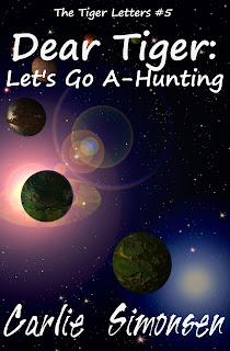
Latest Cover Design—Dear Tiger: Let’s Go A-Hunting

Compared to Blaedergil’s Host, the cover design for this addition to the on-going Dear Tiger series was simple:

Take your template, and make sure you change the title and the number of the book in the series. Now, add your Dreamstime-sourced, base image of planets by Roberto Pirola, linking the series together.


Find a lovely picture of the Ruins of Ta Prohm by VincentSt. Thomas at Dreamstime, and resize it, using the Move tool in the Toolbox sidebar to choose what portion to show on your cover. Highlight the layer featuring the ruins in the layer’s sidebar, and reduce the opacity to 45% using the slidebar at the top.


Add in the spaceship image you sourced from Junichi Shimazakion Dreamstime, and which you have already isolated from its background. Flip the spaceship image and move it to where you want it on your cover using the Move tool, and then highlight the background layer in the Layers sidebar, select the Image tab, and select Autocrop Image from the drop down menu to trim all the layers hanging off the edges of your cover.

The final image for this cover turned out as follows:


Monday, 26 March 2018

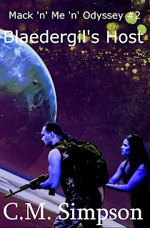
Latest Cover Design—Mack ‘n’ Me: Blaedergil’s Host

Following up from February, I’ve created the second cover in the Mack ‘n’ Me ‘n’ Odyssey series. The second novel, Mack ‘n’ Me: Blaedergil’s Host takes place a little ways down the track and has a bit of political intrigue, but essentially continues the story of Cutter and Mack as they work out their working relationship. 


The first step was the usual use of a template designed for the series.


The second step was a lot easier because of my previous forays onto Dreamstime. I chose a planetary background by Forplayday that had a myriad of stars, because it seemed reminiscent of the word ‘host’ in the novel’s title. It needed to be resized, and then the layer had to be shifted so that it lay under the words for the title and byline.


After that, I used the second in a series of characterimages by Yekophotostudio that I’d found on Dreamstime. I tried out how it looked both under the planet layer, and above it, and decided to over lay it. After that, I isolated the guy and girl elements from the original background, and positioned them at the base of the cover in the foreground.


That was the easy part.

The next step was to get them to blend together to form a more cohesive image. At this point, I decided the flesh tones and natural colouring weren’t quite what I was looking for, although they looked okay.  All manipulation was done in GIMP.


The first thing I did was darken the character image to -29, using the ‘Color Saturation’ tool under the Colors drop-down menu. I then decreased the Hue Saturation to -49 in the ‘Hue Saturation’ tool under the ‘Colors’ drop-down menu, and then highlighted the planetary layer, and
then I played with the ‘Brightness-Contrast’ tool (also found under the ‘Colors’ drop-down tab, and adjusted the entire image, bringing the brightness up to +2, and increasing the contrast to +58.


I still wasn’t happy with the effect, so I used the ‘Color Balance’ tool to adjust the background, increasing the hue saturation by +38, reducing the lightness by -33 and increasing the saturation by +15. After that, I decided I wanted more yellow in the background, so I used the ‘Color Balance’ tool to reduce the yellow-blue balance by -49.


After that, I wasn’t sure if I was happy with the background, or not, so I returned to the step I’d saved as Dev10—and this taught me the important of saving the image at each step, because it’s much easier to go back to a saved step and rework it, than to try to undo everything to get the image looking like it did, at that step. It’s also useful to put the abbreviated changes into the saved .jpg file title, so you remember what you did, when you go back to it.


After returning to Dev10, I used the Color Balance tool to increase the yellow-blue balance by +60, and then reduced the cyan-red to -18, and finally tweaked the yellow-blue colour balance line another -49 on the planetary layer. The last step was to use the Brightness-Contrast tool to reduce the brightness by -49, so that the words became more visible.


This was the image, I finally decided on.


Of course, I then discovered I’d missed something while isolating the character image. The errored image is on the left, the corrected image on the right. I count it as a lesson in vigilance.