I've had the design for Ducky in my head for a couple of months, but no time to execute it... and we all know what happens during execution, right? Yeah... so here's what I did to put the Ducky cover together:
First, I selected a background picture from Dreamstime.com - a devastated city.You can check it out below.

© Photographer: Asiavasmuncky | Agency: Dreamstime.com
After that, I went out to find a picture of a duck - literally. I took my camera out to the local pond.


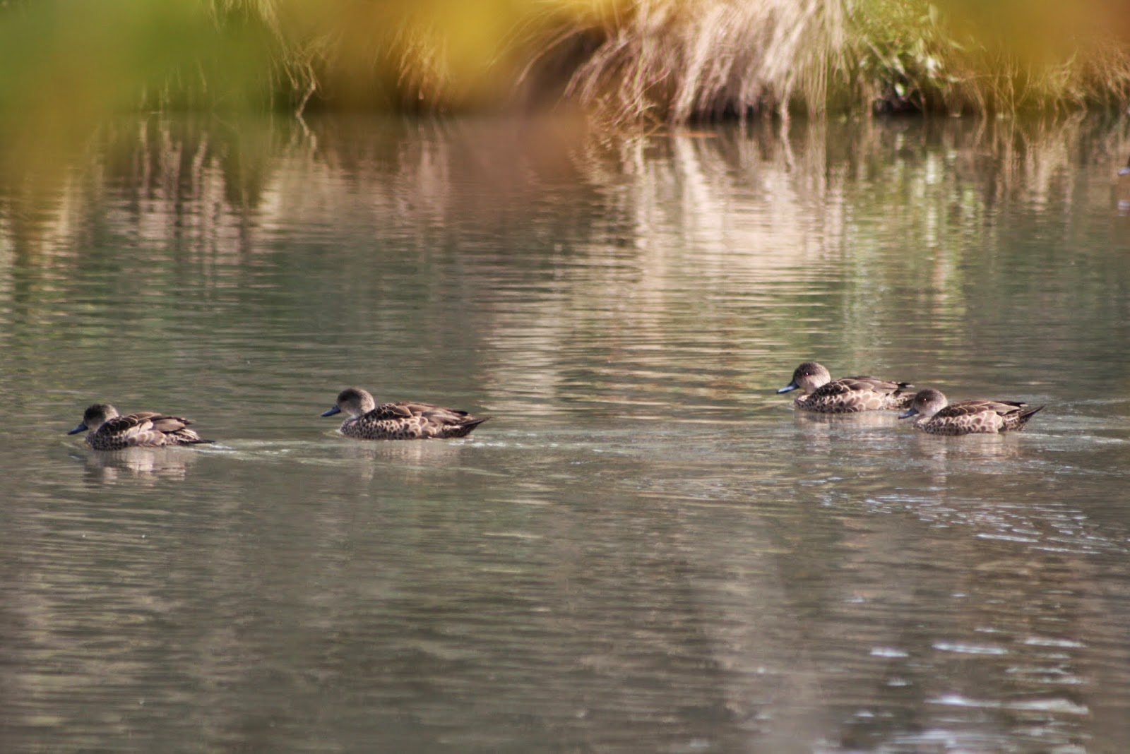
...and ended up settling on the first picture.
Next, I took both pictures and clipped them down to book cover size - I use 1875px wide and 2875px tall.
For the duck, this first entailed enlarging the height of the picture,

followed by trimming the width,

and turning it blue using the TOOLS--COLOR TOOLS--HUE SATURATION selection in GIMP.

I decided that it was too light, so set about darkening it using the TOOLS--COLOR TOOLS--BRIGHTNESS-CONTRAST TOOL selection in GIMP.

4. Once I was happy with the duck and the ruined city trims, I opened a new picture in GIMP, sized it at 1875x2875 and set it at 600dpi. I then used the bucket tool to colour the base layer black.
5. After colouring the base layer, I imported the city trim and then the duck trim as separate layers. I kept the duck layer on top, but reduced the opacity to 64.3 in the Layers dialogue box.


There was still too much empty space between the duck and the title, so I added a short sub-title.

And then, of course, I had second thoughts and tried the cover without the colouring:

And, now, I'm not sure which one to choose...
Until I realised that the duck in the last two pictures was positioned differently, so I moved it...

This time, I think I *do* like the blue one better... maybe.
No comments:
Post a Comment